A Better Way to Develop a Medical Device with Digital and Physical Elements (Part 1 of 2)
.png?width=800&height=400&name=A%20Better%20Way%20to%20Develop%20a%20Medical%20Device%20with%20Digital%20and%20Physical%20Elements%20(Part%201%20of%202).png)
In Part 1 of this blog post series, we explain why next-generation medical devices with hardware/software interactions need a new, holistic development methodology.
In Part 2, we share a new process we have been testing for designing an even more cohesive digital/physical experience
When we look at the world around us, it’s easy to see how the way we experience our physical environment and physical products is increasingly augmented by digital technologies.
Consider the simple, everyday example: locking and unlocking your vehicle.
What was once a hardware-only interaction—inserting a key into the keyhole of your vehicle—has over time transformed into a much blurrier hardware/software experience.
- You can use a wireless key fob to remotely lock or unlock your vehicle.
- You can lock or unlock your car using your phone, via a mobile app.
- You can wave your foot under the bumper to open the liftgate.
The authors gave this presentation to the Industrial Designers Society of America on December 14, 2022.
What Does It Mean to Design for Healthcare at the Intersection of Digital and Physical?
This merging of physical and digital experiences is having a profound impact on healthcare products and services, as well as how we approach designing for these different healthcare solutions.
Let's take our example of unlocking a vehicle and translate it into something more specific to healthcare: performing a surgical procedure.
What started as a set of hardware-based tools and instruments like scalpels and saws has now been increasingly influenced by various digital technologies.
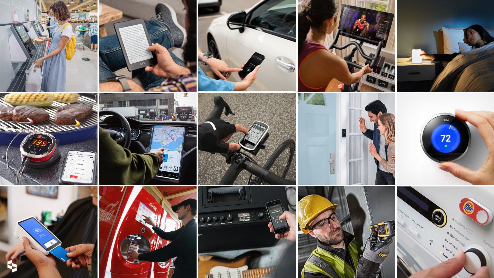
For a specific example of how profoundly a healthcare provider’s experience is being transformed, just think of an endoscopy.
Other new technologies, like robotic-assisted surgery and tele-surgery platforms, are also introducing digital experience and software-based interaction to what was predominantly a physical interaction.
Looking further into the future, it’s fair to guess that emerging technologies like augmented reality, virtual reality, and mixed reality will have an influence as well.
While it’s exciting to imagine where all of this might lead, as design practitioners we also have an important responsibility to consider how these different hardware and software elements combine to create positive outcomes and a great user experience.
We need to think about how the digital and physical aspects of products can be better designed to be cohesive, so we can deliver an exceptional user experience for patients and healthcare providers alike.
In the realm of healthcare, especially, it’s essential that the devices we design are effective, efficient, intuitive, and learnable, and can be used safely by both patients and healthcare providers.
We need to ask how the digital and physical aspects of devices can be more cohesive, so we can give an exceptional user experience to patients and providers alike.
Wherever possible, we also want to strive for additional positive outcomes with our design, such as:
- increasing the job satisfaction of healthcare professionals who use the devices we design
- boosting our client’s brand perception in the marketplace, to advance their business objectives
- reducing product support costs
- reducing waste, to protect our environment for future generations
- eliminating the need for costly product recalls.
Old Product Design Methodologies Aren’t Working
In our work at the intersection of digital and physical design, we are seeing that old product development methodologies, which worked well for decades, are no longer getting the job done. Focused solely on the development of electromechanical devices, they simply don't account for what needs to be done for the new generation of digital/physical devices.
Here are some of the process failures that we have observed or experienced in our own work.

Process Failure #1: The digital and physical experiences are not developed concurrently.
Sometimes this happens because the product development team is simply incomplete; they have not yet onboarded the people who will work on one part of the product or system.
Other times, it’s because the team has a particular comfort level for starting with one part of the product development process vs. another.
Many medical technology companies entered the space creating either hardware or software, not both. So, it's not surprising that the processes and R&D cultures they have in place tend to favor one format or the other.

Process Failure #2: The digital and physical experiences are developed concurrently, but in isolation.
When this happens, it’s often because the combined team doesn’t know when and how best to collaborate across disciplines or design practices, so siloing occurs.

Process Failure #3: The physical experience is prioritized over the digital experience.
This can happen because of the perception of longer hardware development lead times, as well as the need to get things right the first time when it comes to hardware development. Software is often seen as something that can be revised easily, so it is deprioritized as a result.

Process Failure #4: The digital experience is prioritized over the physical experience.
This can happen because of a company’s desire to be perceived as more innovative. They might believe that adding a touchscreen to their device will yield a better user experience, so they invest a lot of development time on that, or on some other novel digital technology aspect of their product, and hardware suffers as a result because it is considered later.
To avoid these process failures, we need a methodology for design at this intersection between digital and physical. To create a cohesive experience for healthcare professionals, we need to adopt a more holistic process.
Can we holistically merge physical and digital design tasks in medical device product development? What would such a methodology look like?
We have been experimenting with a new approach to address this challenge, and we want to share it with you in this two part blog post series.
- In Part 1, below, we reflect on a past project in which Delve’s Interaction Design and Industrial Design teams collaborated to develop a medical device with both hardware and software components.
- In Part 2, we describe improvements to this process that we believe would yield an even more cohesive user experience.
Creating a Cohesive Digital/Physical Experience in Diagnostics
Delve worked on the Baebies FINDER Testing Device, which provides rapid, intuitive blood screening for newborn infants. (Read the full case study here.)
The company needed help to define an effective workflow for their cartridge-based microfluidics technology and to create an integrated digital/physical work experience for the testing device itself.
Below is an overview of the process we went through for this particular project. We’ve overlaid it with a classic design-thinking double diamond diagram as well.
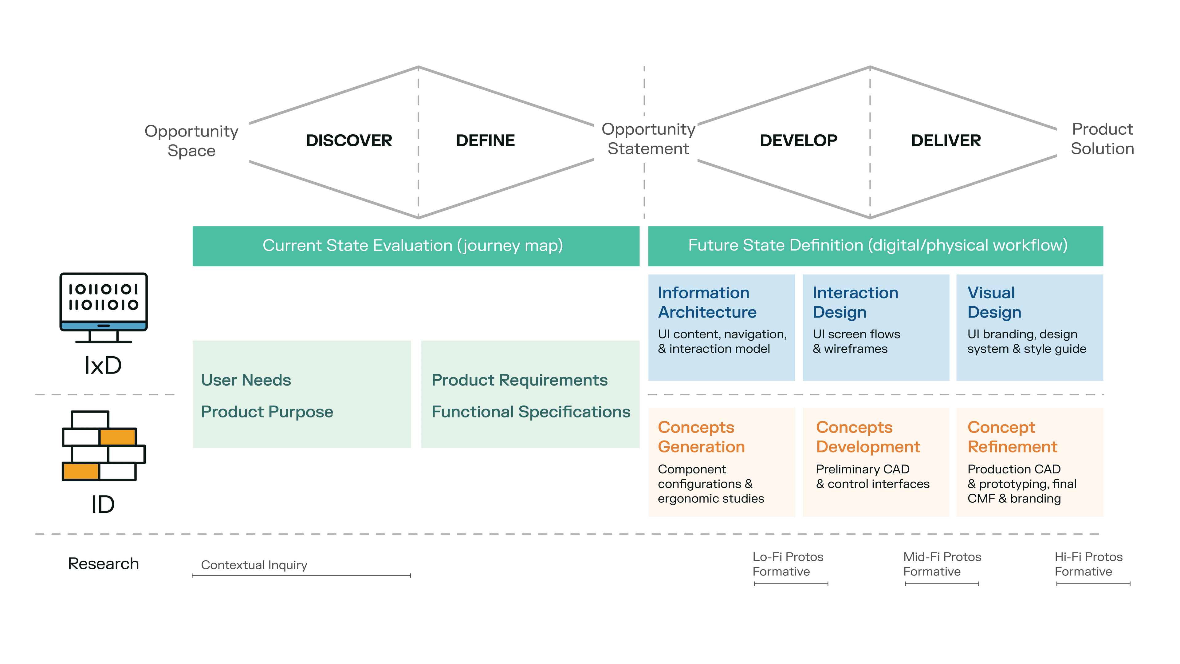
This project was very much a partnership between the client’s Engineering and Quality Management teams and Delve’s Human Factors Engineering, Interaction Design, and Industrial Design teams.
A quick overview of the project:
- Delve’s Human Factors Engineering, Interaction Design, and Industrial Design teams did contextual field research to determine the current state of newborn blood testing.
- Based on the results of our contextual research, we created a current state journey map that expressed what was and was not working in the current state of testing.
- Equipped with the current state journey map, we worked with the client to define the requirements and functional specifications of the device we would design.
- Delve’s Interaction Design and Industrial Design teams then developed a digital/physical workflow that represented the ideal future state for the new device. This was iterated and refined through several design stages.
- The future state digital/physical workflow document served as a crucial “North Star” for Delve’s Interaction Design and Industrial Design teams throughout the design process.
We essentially had two separate work streams of interaction design and industrial design development working in parallel, bound together by the future state definition expressed in the digital-physical workflow document.
The future state workflow document enabled our Interaction Design and Industrial Design teams to work concurrently yet at the same time somewhat independently, while also having buy-in from the client.
Ultimately, this “North Star” guidance for our Interaction Design and Industrial Design teams enabled us to create cohesion between the digital and physical aspects of this particular design.
To better understand how the teams handling the physical and digital aspects of the design collaborated throughout the project, let’s look at each project phase more closely.

Discovery and Definition: Interviewing and shadowing clinicians allowed us to learn about current methods of newborn blood screening and understand their frustrations with current methods.
Working with Users to Explore and Define the Problem
Delve’s Human Factors Engineering, Interaction Design, and Industrial Design teams interviewed medical lab technicians and phlebotomists to learn about the current methods of newborn pediatric screening.
We shadowed neonatal nurse practitioners at hospitals of various sizes to try to understand the frustrations and issues with current newborn blood testing.
We also talked to hospital department heads to understand how test results feed into existing information systems.
 Current State Definition: Journey mapping existing processes revealed pain points and opportunity areas for the new device. Click here to view full image.
Mapping the Current User Journey Pain Points
As a result of the previous step, Delve’s Interaction Design and Industrial Design teams were able to jointly create a journey map that described existing testing processes for newborn blood samples and revealed the pain points and opportunity areas for the new device.
There were particular areas that were identified as challenges for clinicians.
For example, the initial sample collection from the baby itself required quite a large volume sample. Actually getting that sample to a traditional lab setting would often require nurses to walk that sample from one part of the hospital to another.
Then, the sample itself required further preparation prior to testing, which elongated the total testing time required.
Equipped with the current state journey map, we worked with the client to define the requirements and functional specifications of the device we would design.
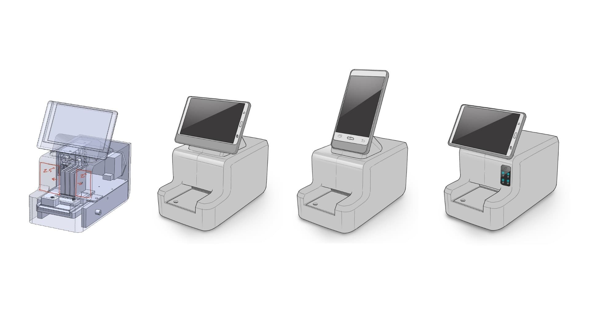
Information Architecture and Concepts Generation: Delve’s Interaction and Design teams worked concurrently in the first design phase.
Generating Design Concepts to Meet Device Requirements and Specifications
In the first phase of design work, Delve’s Interaction Design and Industrial Design teams worked concurrently.
Delve’s Interaction Design team explored what interaction models we wanted to have for this device; what the UI content would be; and what navigation structure would deliver a guided workflow.
We wanted to guide the user through the entire process, from logging into the device to actually conducting a test, and uploading that test information to a system.
In parallel, the client’s Engineering team and Delve’s Industrial Design team collaborated to create physical interaction models; explore physical controls and interface touchpoints like the cartridge loading; and work with the component configurations and screen formats that would drive overall form and size.
We knew at this point that we wanted to leverage an off-the-shelf tablet that would reduce the overall development time for the client, but we weren’t sure what size, what orientation, and where that tablet might sit to deliver the software experience that we were looking for.
So, we generated and evaluated different ergonomic layouts.
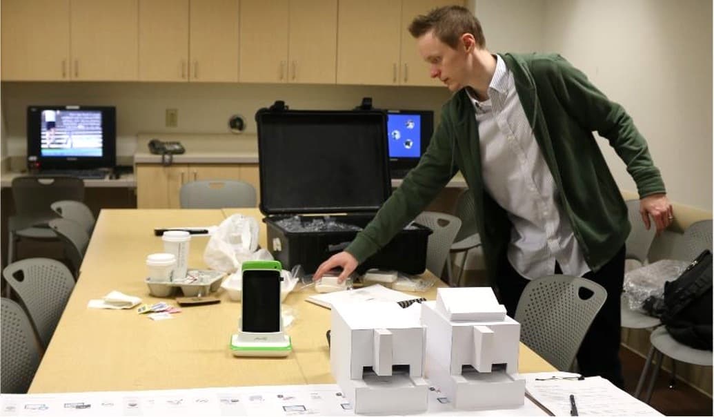
Lo-fidelity formative testing allowed us to validate the current state journey map and test our early user interface content and navigation ideas.
Lo-Fi Prototype Testing to Validate Early Design Concepts
The previous stage of design work enabled Delve’s Human Factors Engineering, Interaction Design, and Industrial Design teams to:
- do some low-fidelity formative testing to validate the current state journey map
- validate that the clinicians’ frustrations and perceived opportunities aligned with what we were thinking
- test our early user interface content and navigation ideas, to make sure we were creating an intuitive workflow guided by the device.
Delve’s Industrial Design team also used low-fidelity mockups to obtain critical feedback on the physical device, screen placement, and test cartridge interaction preferences.


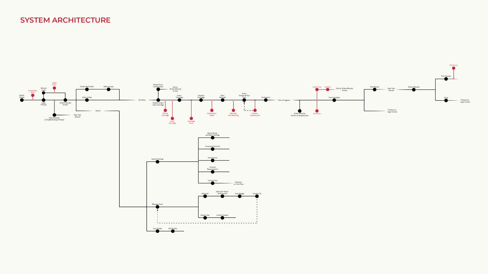
Future State Workflow: This visualization of the ideal state across digital and physical interactions guided our work to ensure that we would ultimately deliver a cohesive and intuitive user experience.
Click here to view full image.
Defining the Ideal User Journey
Leveraging our formative testing insights and information architecture work, Delve’s Interaction Design and Industrial Design teams collaborated to create an ideal state workflow.
The workflow visualized, step by step, the digital and physical interactions throughout the user journey. Our goal was to ensure that all digital and physical interactions were fully synced so the workflow would be as intuitive and coherent as possible.
For us, this became a “North Star” living document shared by our client and by Delve’s Interaction Design team and Industrial Design teams to guide our work and ensure that we would ultimately deliver a cohesive and intuitive experience.
We used it as a foundation for design and development moving forward. The document was not fixed. Rather, it was updated and refined as the design processed, and repeatedly reviewed with the client throughout the process.
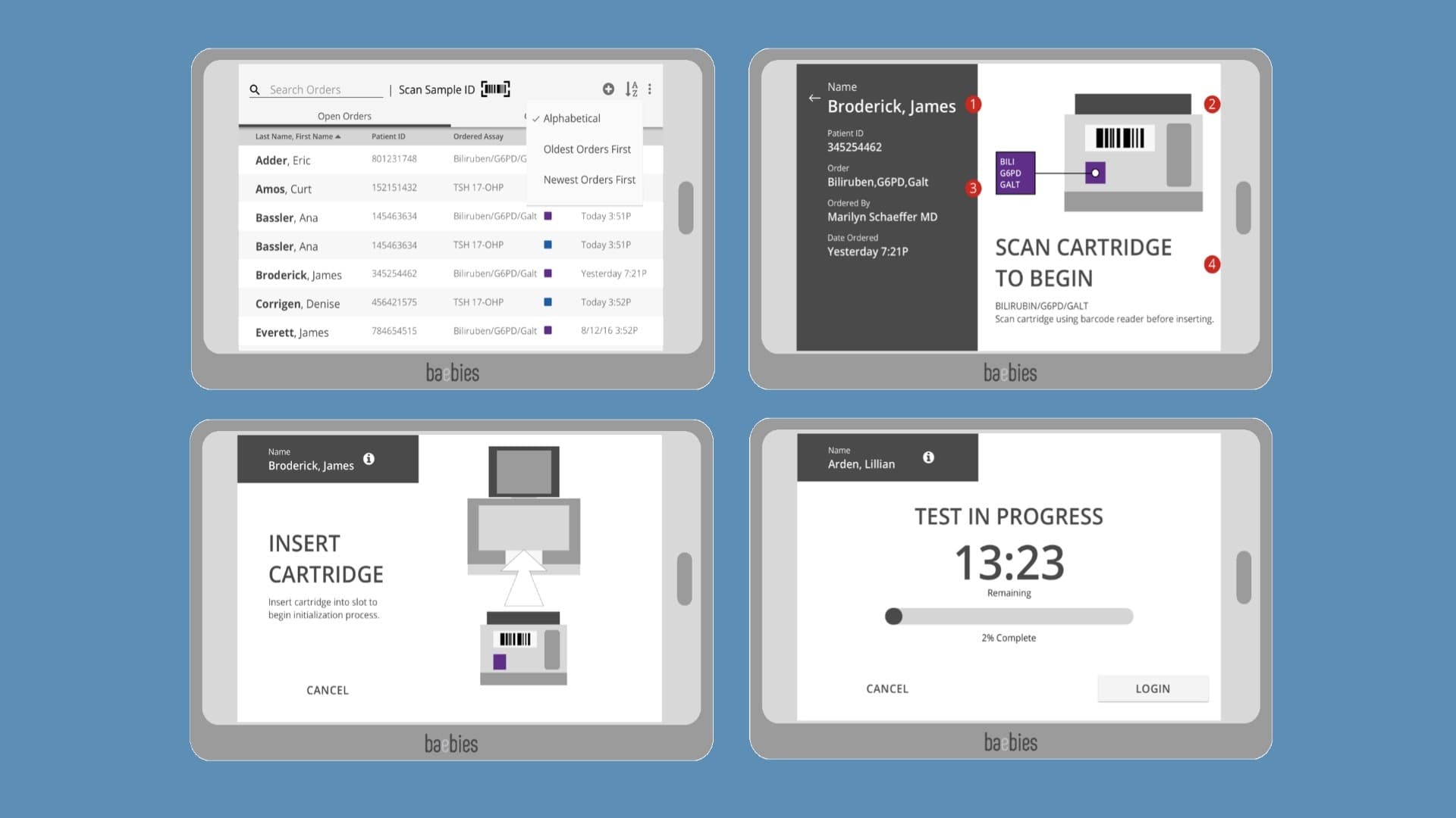
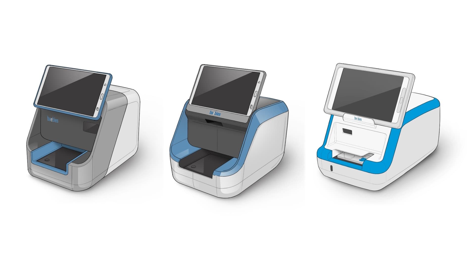
Interaction Design and Concept Development: Delve’s Interaction Design and Industrial Design teams worked concurrently in the second design phase.
Developing and Refining the Design in Collaboration with Users and the Client Team
In the second phase of design work for this project, the Interaction Design team developed UI screen flows, wireframes, and produced mid-fidelity prototypes that we could test with clinicians on existing tablets to see if the workflow was working for them.
Concurrently the Industrial Design team advanced the preliminary CAD surfaces for the preferred concepts, detailing out those control and interaction areas, looking at the initial color and branding options, and working closely with the client’s engineering team to define the overall footprint for the device.
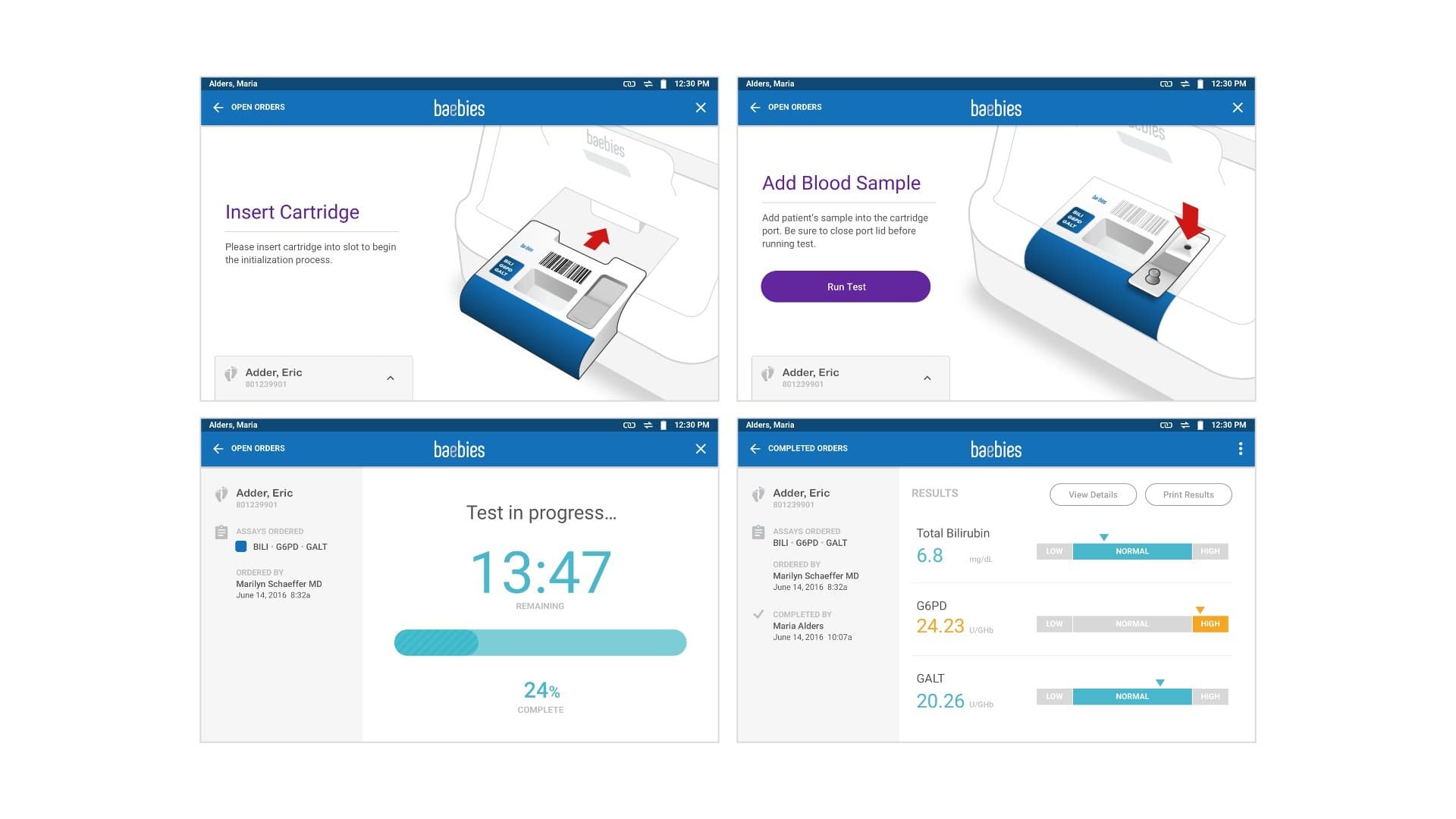
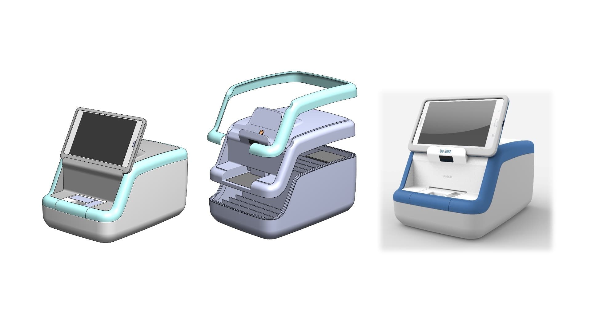
Visual Design and Concept Refinement: Delve’s Interaction Design and Industrial Design teams worked concurrently in the final design phase as well.
Incorporating the Client’s Brand into UI and Device Design
In the final phase of interface visual design and industrial design concept refinement, the Delve Interaction Design team reviewed how the client’s branding would be incorporated into the user interface.
They created a full design system, applying visual design to key wireframes, and producing an accompanying style guide that our client’s software team used in programming the product.
Concurrently, the Delve Industrial Design team were finalizing the production CAD and part break-up and finalizing the colors, materials, finishes, and branding that we would be executing on the physical device. All this was handed over as a package to the client’s engineering team for them to implement at the end of our involvement.
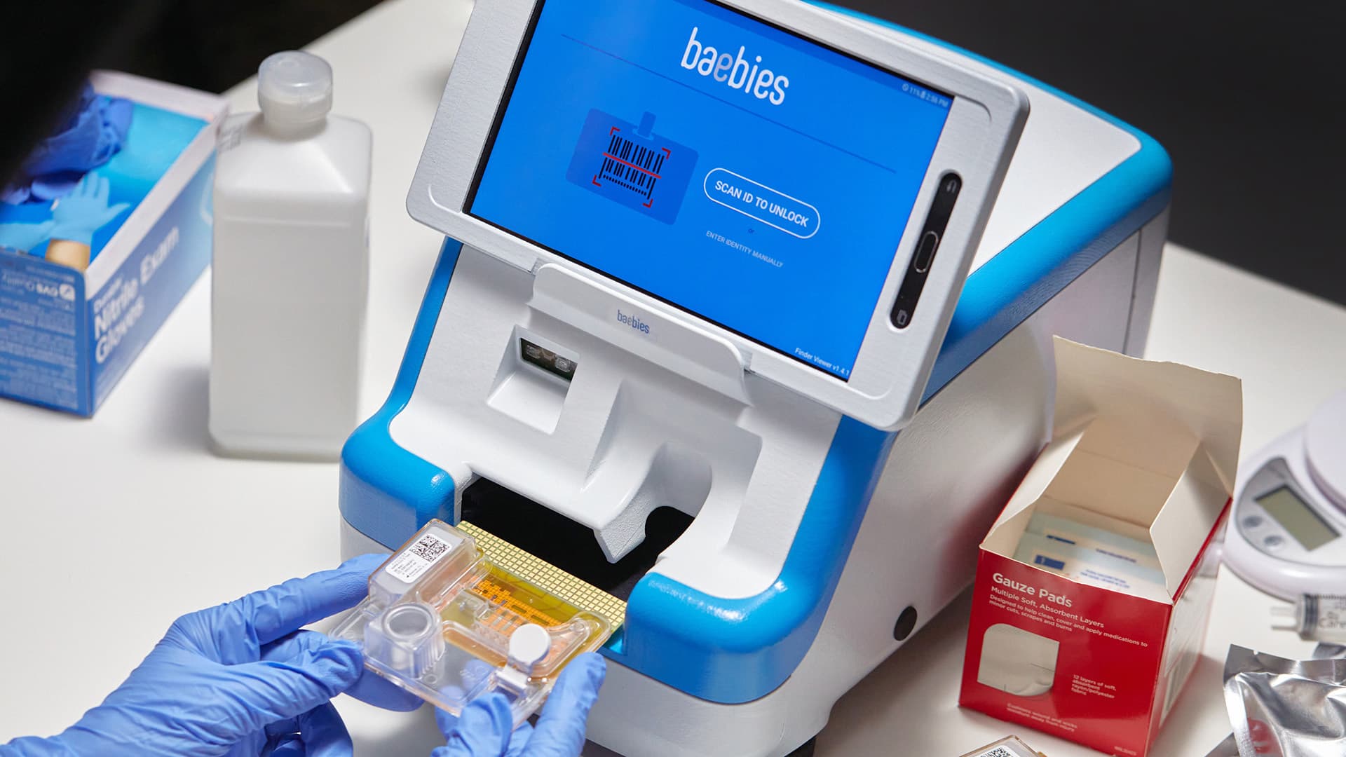
The increased collaboration and awareness between members of the Interaction Design the Industrial Design teams yielded a more cohesive user experience.
The Outcome
The Baebies FINDER device is available and on active duty today. It was honored as a finalist in the Testing and Diagnostic Products and Systems category of the prestigious Medical Design Excellence Awards (MDEA) competition. It also received second place in the Design Management Institute Design Value Awards.
In our view, the Baebies project is an example of how close collaboration between interaction design and industrial design does produce a more cohesive user experience between digital and physical.
But every process has room for improvement.
As we reflect on the Baebies project and look to the future, we see opportunities to refine our methodology and move even closer to our goal of a truly cohesive digital/physical experience.
We’ve been experimenting with a new methodology for designing medical devices with hardware/software interactions. In Part 2 of this blog post series, we describe what that new, holistic development process might look like.
Click here for Part 2 of A Better Way to Develop A Medical Device with Digital and Physical Elements.
This article was originally posted on the Delve Blog and is being republished here with permission.
Ken Soliva is Delve’s Senior Director of Interaction Design. He has more than 20 years of experience helping people enjoy better interactions with technology through the design of digital products and services. His work as a designer and leader has spanned digital devices, mobile apps, websites, web and desktop...


