3 Common Problems with Design Controls (and the Solutions)
.png?width=860&name=3%20Common%20Problems%20with%20Design%20Controls%20(and%20the%20Solutions).png)
The first time you looked at 21 CFR Part 820.30—FDA’s regulations for design control—you probably thought, “Is that it?”
FDA’s design control regulations are notoriously short and open to interpretation. You have obligations you’re required to fulfill, but you have leeway in how you carry them out.
While it’s good that FDA doesn’t prescribe exactly how each company should operate, it also means medical device companies face a lot of challenges interpreting the regulations and implementing design controls.
So today, I want to look at three of the biggest issues medical device companies run into as they move through the design control process—and how to fix them.
FREE DOWNLOAD: Click here to download your free PDF copy of seven rules you can follow for effective medical device design controls.
1. Risk management isn’t integrated into design controls
Separating risk management and design controls is one of the most common problems for medical device companies. In fact, in our 2022 State of the Medical Device Industry benchmark study, more than a quarter of companies reported that implementing risk control measures was the most painful part of managing design controls.
Part of the problem is organizational structure. In many cases, the teams working on design controls and risk management aren’t properly integrated. There’s a team of engineers working on design controls and building the product, and another team working on documentation for risk management.
In this situation, there’s very little opportunity for risk to influence the design of the device.
What’s the solution?
What you really want is for both those groups to be integrated, working together and creating a constant feedback loop where your design controls inform risk management, and then your risk management activities inform your design controls.
Your user needs and design inputs are critical to identifying hazards and hazardous situations. Once you evaluate the risks from those hazardous situations, however, there’s a good chance you’ll need to reduce them through risk controls.
The number one way to do that is through changes to the design. Which means—you guessed it—changes to your design controls.
Integrating risk management and design controls allows you to identify risks early on and then go back and update the design to eliminate or minimize them—before you have a finished product.
The organizational solution here is to start risk management as early as possible and use a purpose-built QMS that integrates design controls and risk management in its functionality.
But the biggest roadblock to integrating the two is probably psychological. No one—in any job—likes to go back and redo what they’ve already done. If the design has to be updated to mitigate a risk, it’s human nature to feel like you’re going backwards—moving farther from the goal of a finished product.
My only advice here is to reconsider that goal. Is it a finished product, or is it the safest, most effective product you could have possibly built? If it’s the latter, returning to your design is actually a step forward.
2. User needs don’t drive design inputs
Writing user needs and design inputs is a craft. The language you choose is a determining factor for the design of your device.
There’s too much at stake to use vague or imprecise language, even though that’s exactly what the people charged with writing user needs often do.
For instance, if I tell you that one of the user needs for a device is that it “needs to be safe”, you would have some questions. What definition of safe are we using? Safe compared to what? Does safe mean different things to people in different cultures? How will I validate “safe”?
This is the trouble with vague or relative language. It doesn’t drive specific design inputs and it’s practically impossible to validate.
What’s the solution?
Now, how about I tell you that a user need is “the device must be capable of one-handed operation.” How does that specificity change our ability to move forward?
Well, it means we need to use the human factors engineering standard for medical devices, HE75:2019, to ensure that our device will fit in hands between the fifth and ninety-fifth percentile for hand size (assuming the strength of your user population falls within that range). It means the device can’t be so heavy that its weight interferes with one-handed use. It also means we need design inputs related to usability like texture and ergonomics.
From that one user need, you’re able to quickly identify several design inputs you know for certain we’ll need.
There will always be some negotiation on the language of user needs and design inputs, but your best bet is to begin with the end in mind. Put yourself in the shoes of the person who will incorporate the user needs you write. Would you be able to validate this user need? Let the answers to these questions inform your writing.
3. The design freeze dilemma
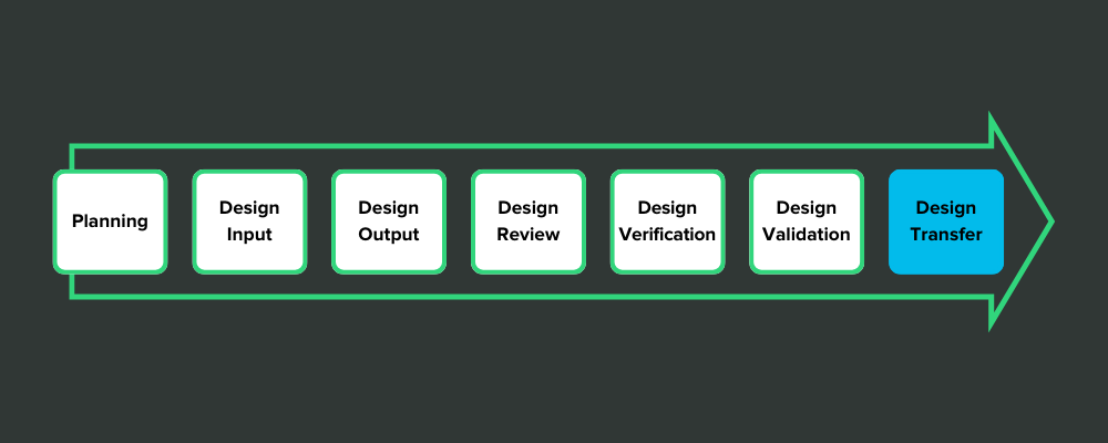
Some medical device companies view design controls in a strictly linear fashion. Like stepping stones in a pond, they think they have to jump from design inputs to design outputs—and keep hopping until they’ve reached the design transfer stone.
It looks something like this:

This view of design controls is exemplified by the design freeze.
Here’s how it works: After the design outputs have been defined, the company holds a design review and decides that everything is as it should be. Then they issue a design freeze so that no more changes can be made to the design. That gives them a frozen design for verification testing.
There’s nothing wrong with that, in theory. But in practice, medical device companies often get freeze-happy.
After they complete their design inputs, they order a design review and freeze the inputs. After design outputs are finished, they hold a design review and freeze the outputs. After each stepping stone, they issue a design freeze so they can move on, safe in the knowledge that no more changes will be made.
The problem is, sometimes you need to go back to a design control you’ve moved on from. And once it’s “frozen,” you have to overcome more inertia to do so.
If there are usability issues, for example, that you didn’t notice until you got to validation, it’s painful to go back to your user needs—but it’s necessary. As I mentioned before, the pain now is nothing compared to what you’ll experience if you take a “good enough” product to market.
What’s the solution?
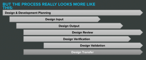
The fix here is to change the way you look at design controls. They may seem like stepping stones at first, but that’s not an accurate representation. They really look something more like this:

Once you internalize the overlapping nature of design controls, there’s less pressure to freeze each step and move on.
Sometimes it’s good to draw lines in the sand; otherwise you’ll get bogged down in a thousand revisions and new ideas. But you should never be afraid to step back over that line in the service of bringing the safest, most effective device to market.
FREE DOWNLOAD: Click here to download your free PDF copy of seven rules you can follow for effective medical device design controls.
Upgrade your design controls with purpose-built software from Greenlight Guru
Design controls can hold all kinds of pitfalls for medical device companies. And as you progress through design and development, it can be easy to become focused simply on complying with the regulations, rather than achieving True Quality.
That problem—compliance rather than quality—is why we started Greenlight Guru in the first place. Our Medtech Lifecycle Excellence Platform does more than just help you meet the requirements. Our cloud-based platform allows you to bring safer products to market faster, while reducing risk and lowering costs, all in an effort to shift the focus from compliance to True Quality.
If you’re ready to see what a purpose-built QMS can do for your business, then get your free demo of Greenlight Guru today.
Etienne Nichols is the Head of Industry Insights & Education at Greenlight Guru. As a Mechanical Engineer and Medical Device Guru, he specializes in simplifying complex ideas, teaching system integration, and connecting industry leaders. While hosting the Global Medical Device Podcast, Etienne has led over 200...
Related Posts
The Ultimate Guide To Design Controls For Medical Device Companies
The Risk Management + Design Controls Connection: What Device Makers Need to Know
5 Tips for Medical Device Engineers on FDA Design Controls
Get your free PDF
7 Rules for Effective Medical Device Design Controls


